


Another way to think about money.
Lonmile
Family office
Website redesign for a century-old family office

Lonmile
Family office
+54%
Time on key pages
–29%
Navigation bounce rate
+38%
Contact requests
+71%
Module interaction
A century,
a new language.
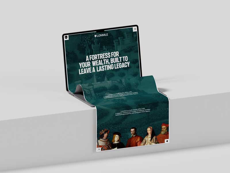
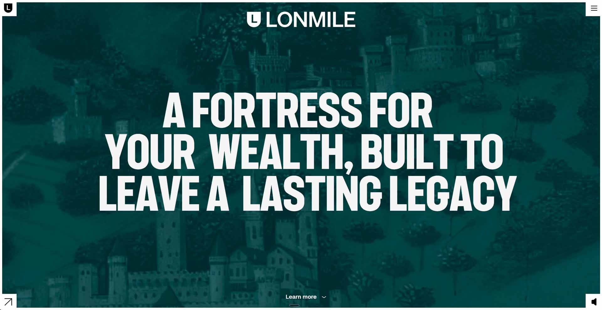
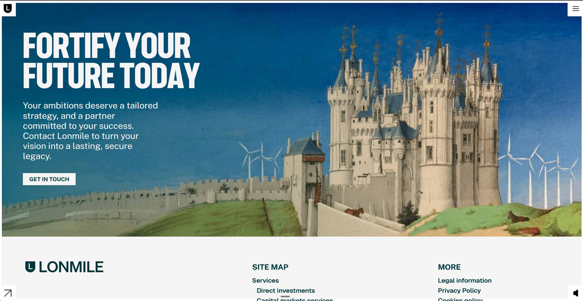
Lonmile is a multi-family office with a century of history: it protects and grows families’ wealth. Its website had to get that across clearly, with the authority that kind of track record brings. The challenge was a website redesign that changed how it communicates without losing its essence.

Clarity before
frills.
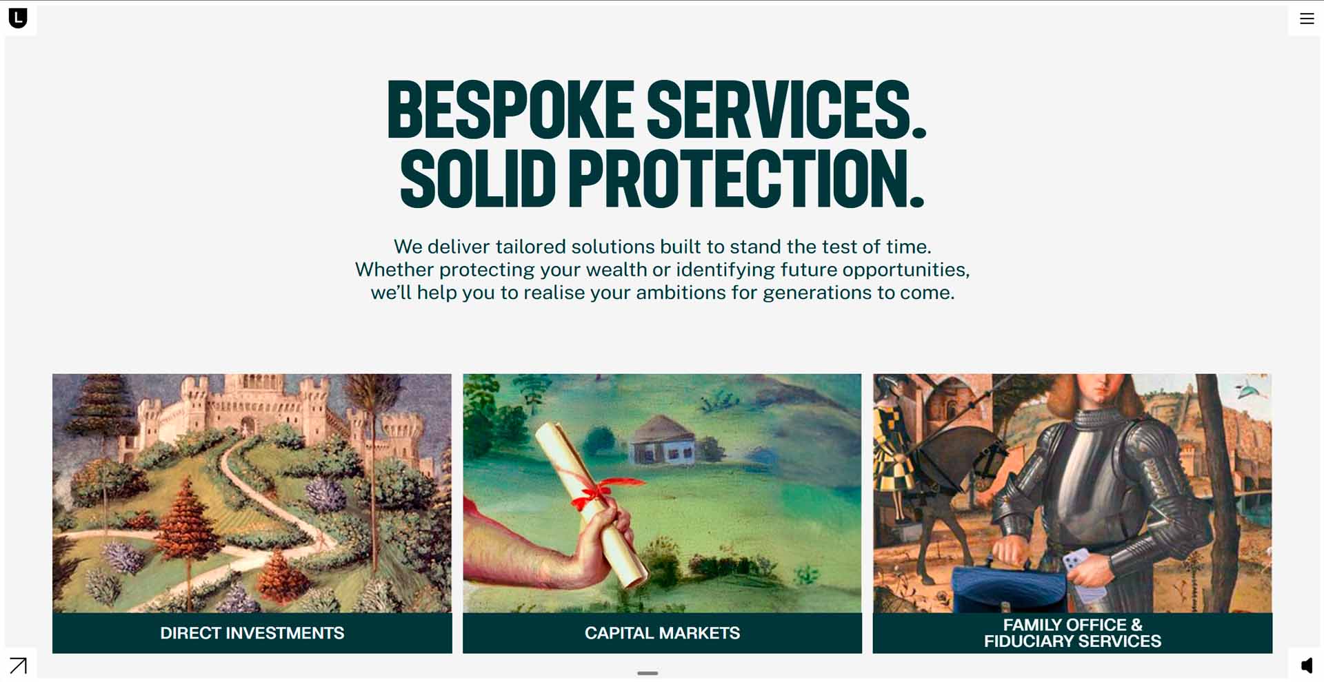
I redesigned the website starting from the content hierarchy, not the look.
- Services by business line: each area with its own space and message.
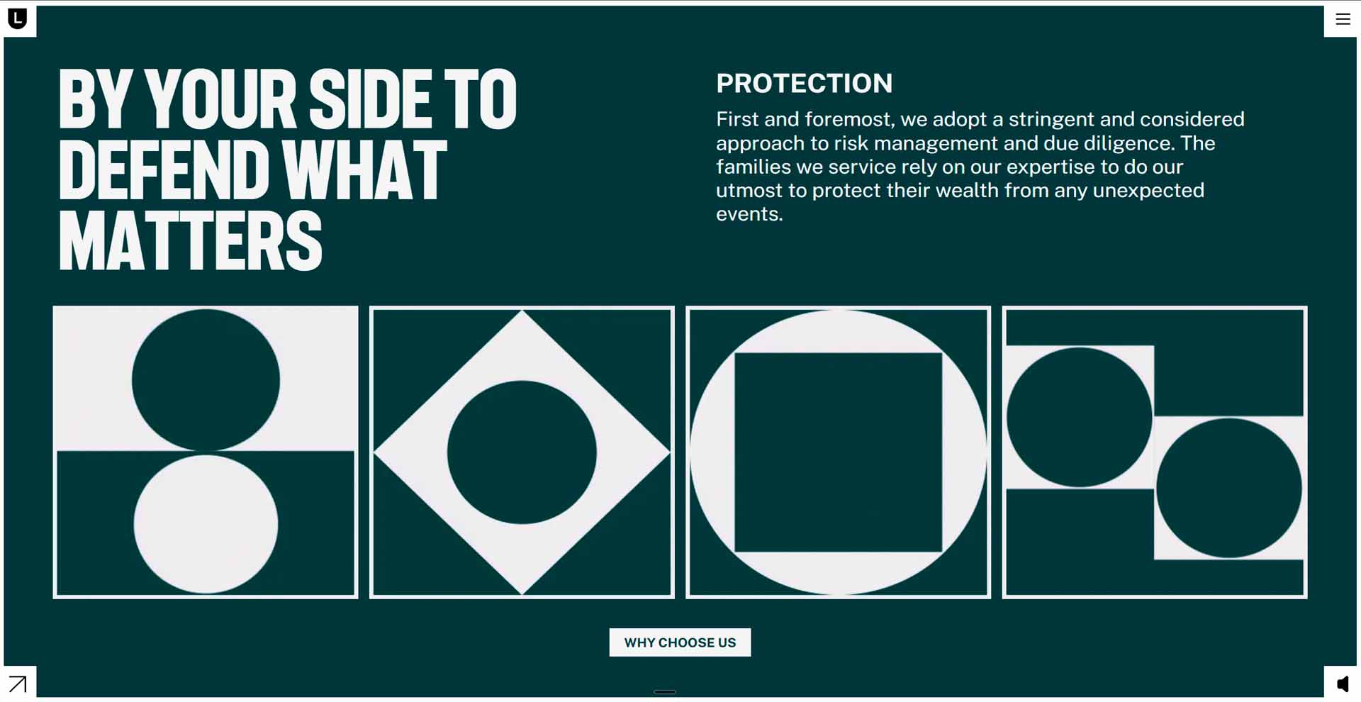
- Interactive modules: the complex stuff explained step by step, no walls of text.
- Visible contact: there on every path through the site, no hunting required.
- Understated design: worthy of a century of history.
More time,
more enquiries.
Time on key pages rose 54% and contact requests 38%, while the bounce rate fell 29% and module interaction grew 71%. When people understand what you do, they get in touch.
A website redesign doesn’t always start with new colours or typefaces. In a company with a hundred years of history, users were held back by not finding what they were after, not by the look. So the work was architectural: what gets said first, what gets grouped and where you ask for contact. Order before ornament.
Websites as good as a French croissant

Cléo Sulem
Art director at ACHOS!, the agency behind the project
Other projects
More cases,
real results.

Designs that convert and make your competitors sweat a little.




Keep scrolling
for more.