

An online shop doesn’t stop selling overnight. It starts failing quietly.
The conversion rate drops, abandoned baskets go up and the traffic comes in, has a look and leaves. If you think it’s seasonality, the market or a bad patch, you’re wrong. When an online shop stops performing, the problem is usually structural: the server, the source code or the usability architecture is screaming for attention.
Let’s look at the real technical and strategic bottlenecks, and how to increase online shop sales again.

1. A conversion rate in free fall
You’ve got targeted traffic and a competitive catalogue, but the funnel breaks at the critical point. The problem almost always lies in friction during the purchase.
I’m talking about endless checkout forms with no real-time validation, payment gateways slow to process the request (Stripe or PayPal API failures) or delivery cost rules calculated too late that wreck the experience. If people come in and don’t buy, don’t pay for more ads. Stop the leak by fixing the conversion flow.
2. Your site loads slowly or throws errors on mobile
Tolerance for waiting is zero today. If your shop takes more than 2 seconds to render the main content (LCP), the page jumps around as you scroll because images have no set dimensions (high CLS) or JavaScript blocks the main thread on a smartphone, the customer leaves.
Today the vast majority of transactions happen on mobile. If the server is slow to respond (high TTFB), you’re burning money on every visit. Performance optimisation (WPO) isn’t a cosmetic extra. It’s basic infrastructure. It needs a technical web development approach able to strip out unnecessary requests and optimise the database.
3. Your design looks five years old
Online, design goes off fast. Heavy shadows, rigid layouts based on old themes and no visual hierarchy all say ‘nobody’s looking after this’.
It doesn’t matter if your product is the best on the market or your pricing is the most aggressive. If the look and the interface of your shop raise doubts about its security or how up to date it is, the customer won’t type in their card details. In ecommerce, looks are first and foremost a trust factor.
4. Your competitors already look better than you
Today’s shopper is analytical: they open five tabs at once before deciding to buy. They compare you in real time.
If your competitor offers smooth single-page navigation, basket updates via AJAX without reloading the page and one-step checkout, the decision is obvious. All else being equal, the best product doesn’t win. The platform that creates the least friction during the transaction does.
5. Your products get lost in the navigation
You’ve got hundreds or thousands of products, but the shopper can’t find what they’re looking for.
The problem is usually a badly configured faceted search, useless filters that reload the whole page and chaotic categories. On the server side, complex searches over big catalogues without optimised indexing generate SQL queries that floor performance. The ecommerce UX rule is strict: if the customer has to think too hard or make more than three clicks to narrow down a product, they abandon the session.
What you can do without losing your rankings
You don’t always have to wipe the database and migrate platform. If the backend is solid, the smart first step is a technical web consultancy to make surgical improvements without changing the URLs Google has indexed:
Rework the UX and the checkout: Simplify navigation, redesign product pages around conversion and cut payment down to the strictly necessary. Fewer fields, clean conditional logic and straight to the sale.
Technical clean-up and WPO: Audit the network waterfall. Use WebP, defer render-blocking scripts, purge unused CSS and set aggressive server-side caching (Redis/Memcached).
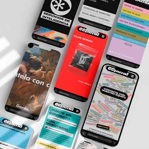
Strategic interface redesign: Update the visual hierarchy with a light design system to guide attention towards the action buttons (CTAs) and remove visual noise.
Restructure the catalogue: Optimise database queries and fine-tune the filters so navigation is instant.
Iterate, don’t destroy: An online shop grows by measuring events. Gradual, controlled changes based on real user data.
Don’t let poor technical infrastructure hold back your turnover. A complete redesign, fast and profitable. Find out more about my premium online shop services and turn your platform into an efficient sales system.
That’s what I did in the Muebles.com shop redesign: catalogue reorganised and a shorter checkout. Conversion rose 47% and traffic 63%.