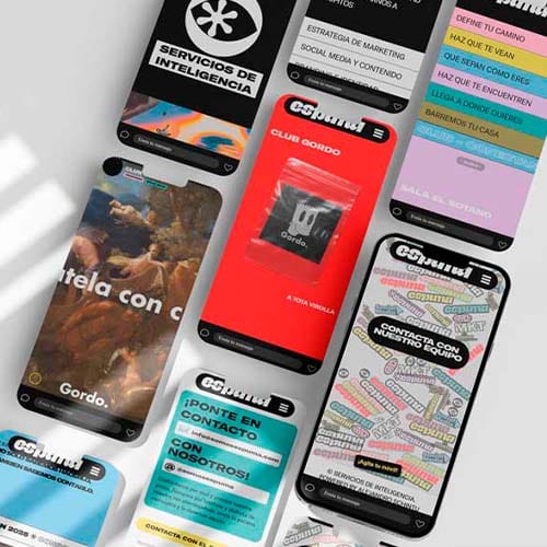


There’s a popular idea that responsive design just means nothing spills off the screen. You test it by dragging the corner of the browser until everything stacks, check that nothing overflows and call it done.But that test only measures whether the width adapts, and nothing else. It doesn’t tell you whether someone can use your website one-handed, in the street, on mobile data and in a hurry.Fitting isn’t working.
Timeline of a responsive site that wasn’t
I’ve watched this play out so many times that I already know which week each symptom turns up in.Week 1. The mock-up gets signed off on a 27-inch screen. Everyone nods.Week 4. It goes live. Someone opens it on their phone, glances over it on Wi-Fi and says it ‘looks fine’.Month 2. The first complaint arrives when a client can’t find the phone number. It was tucked in the drop-down menu, which on mobile sits behind two taps.Month 5. The form brings in fewer enquiries than expected, and nobody connects it with the fact that on small screens the fields sit three full screens of scrolling below the top.Month 9. Someone pays for ads to make up for it. Traffic goes up. Enquiries don’t.Designing on a laptop and publishing for mobile is like preparing for the match on your home pitch and then playing every single game away. The opposition doesn’t change, but the pitch does, and the pitch decides the result.The four criteria that actually matter
These four criteria are what separate responsive web design from a site that has simply been squeezed:- Breakpoints set by content, not by device. Breakpoints go wherever the design starts to break, not at whatever widths happen to be fashionable. Chasing specific phone models is a race you’ve already lost.
- Real tap targets. A button needs a comfortable touch area and enough space from its neighbours. Two links crammed together in a list are two mis-taps waiting to happen.
- Images served by size. With
srcsetandsizes, a phone downloads the small version instead of the desktop one scaled down. Without that, your user pays for your design with their own data. - Stability while loading. Every element needs its space reserved before it appears, or the content jumps and the thumb taps somewhere it never meant to. The exact threshold is in what each Core Web Vital measures and how to fix it.
Mobile first isn’t about starting with the phone
Mobile-first design gets sold as a question of order, with the small screen first and the big one later. The order is the least of it.What really changes is what you decide when only three things fit. A 27-inch screen has room for the hook, the video, the six services, the three trust badges and the cookie notice without anyone having to choose. At 390 pixels wide you have to choose whether you like it or not, and that choice is the design.That’s why a well-planned responsive website usually turns out better on desktop too, because someone had to decide what was essential.The usual mistake is the opposite. The responsive site is designed big and approved big, and when it’s time to shrink it nobody wants to cut anything, so everything gets stacked vertically. The result is a website that adapts perfectly on paper and a six-metre column in the user’s hand.If you have to stack nine blocks to make it fit, the width was never the problem.Responsive vs adaptive: what’s the difference
They get used as synonyms, and they aren’t. A responsive design is fluid, so the same HTML rearranges itself continuously to suit the available width. An adaptive design works with a handful of fixed layouts and serves whichever one matches each range of screen sizes.Adaptive gives you more control over each size, but it forces you to maintain several versions and leaves gaps between one range and the next. Responsive takes more thinking at the start and you only maintain it once. For a business website, it’s responsive almost every time. Adaptive only makes sense for very specific interfaces, such as a dashboard used on two or three known devices.Three tests you can run today
You don’t need paid tools or any technical knowledge for these.Open your website on your own phone, on mobile data with the Wi-Fi off, standing up in the street. Try to reach the phone number or the contact form with one hand. Count the taps.Turn the phone sideways and watch how many designs fall apart in landscape, simply because nobody ever tried it.And come in through a link, not through the home page. Plenty of your visits land on an inner page, and that page has to work on its own as well.What isn’t responsive design
Three things that get sold as ‘mobile-friendly’ and aren’t responsive design at all.First, a desktop website with zoom enabled, where you can see everything and use none of it. A separate mobile version on another URL, which doubles the maintenance and splits the signals. And hiding blocks on mobile to squeeze the page in, which isn’t adapting but amputating, and the cut usually lands right on whatever you sell.Zero content hidden just to make things fit.The other half of the problem isn’t technical: it’s what the user finds once they can finally use the screen, and that’s where UX work on the friction that stalls a conversion comes in. And if the page structure doesn’t hold up on a small screen, it won’t hold up for whatever crawls it either, which is the same point I make about the hierarchy search engines read.For small businesses this explains more lost enquiries than you’d think, as you can see in the faults an audit turns up on small business websites and in what every second of waiting on a phone costs you.I don’t sign off a design until I’ve opened it on a real phone, on mobile data, holding it in one hand. The browser emulator is for building layouts, not for making decisions. And if anything is a struggle in that test, it changes before launch, even if it was already approved on the big screen. That’s the order I follow in every website I build.